
ETF Overview
Schwab U.S. Large-Cap ETF (NYSEARCA:SCHX) has a portfolio of 750 largest U.S. stocks by market capitalization. The fund has delivered slightly inferior total returns than the S&P 500 index in the past but has very similar portfolio mix, even their top 10 holdings are identical. Most of these top 10 holdings are technology stocks with strong growth potential. They have been the main drivers of SCHX and the S&P 500 index’s performance in the past, and is expected to continue to outperform in the foreseeable future. Given the S&P 500 index only consists of 500 stocks as opposed to SCHX’s 750 stocks, the proportion of the top 10 stocks in SCHX’s portfolio is slightly lower than the S&P 500 index. Therefore, we expect SCHX to continue to slightly underperform the S&P 500 index. Hence, we do not think investors need to own SCHX.
YCharts
Fund Analysis
SCHX has performed very well since late 2022
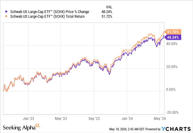
Like the broader market, SCHX has done very well since reaching the cyclical low in October 2022. As can be seen from the chart below, the fund has delivered an impressive price return and total returns of 48.2% and 51.7% respectively. This result is quite good but still trailed the S&P 500 index’s total return of 51.1%.
YCharts
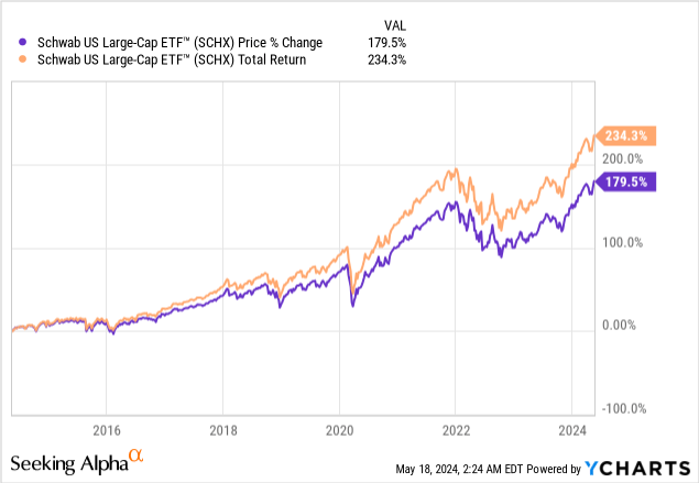
Since its inception in November 2009, SCHX has delivered an impressive total return of 521.8%. Despite this strong return, it still trailed the total return of 523.0% of the Vanguard S&P 500 ETF (VOO), which tracks the S&P 500 index.
YCharts
SCHX has a portfolio that is very similar to the S&P 500 index
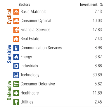
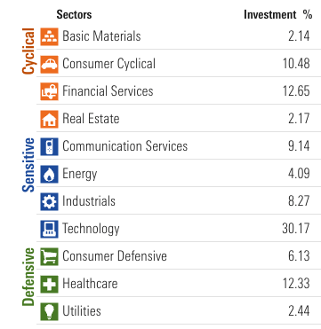
Based on our disucssion so far, SCHX appears to consistently trailed the S&P 500 index in the past. How can we explain this? It cannot be the expense ratio as both SCHX and VOO have identical expense ratios of 0.03%. Can it be sector representations? As can be seen from the chart below, SCHX’s largest 3 sectors are technology (30.9%), financial services (12.8%), and healthcare (11.9%).
Morningstar
Sector Representation in SCHX’s Portfolio
On the other hand, technology sector represents 30.2% of the S&P 500 index as the chart below shows. The index’s 2nd and 3rd largest sectors are financial services and healthcare sectors, representing 12.7% and 12.3% of the index respectively. In reality, the difference between SCHX and the S&P 500 index is small. Even technology sector has higher proportion in SCHX’s portfolio than the S&P 500 index, representing 30.9% of SCHX’s portfolio. This is 72 basis points higher than the S&P 500 index. This still does not explain why SCHX has slightly inferior performance than the S&P 500 index as SCHX has higher proportion of higher growth technology stocks in its portfolio.
Morningstar
Sector representation in the S&P 500 Index
We think the reason why SCHX has a slightly inferior total return than the S&P 500 index is due to the total number of stocks in its portfolio. As we know, the S&P 500 index includes about 500 large-cap stocks. In contrast, SCHX’s portfolio has about 750 large-cap stocks. Given both constructs the portfolio by market-capitalization, SCHX’s top 10 stocks only represent about 31.1% of its total portfolio. In contrast, the S&P 500 index’s top 10 stocks (identical to the top 10 stocks of SCHX) represent about 32.5% of the total portfolio. The difference is not huge. However, given that these 10 stocks such as Apple (AAPL), Microsoft (MSFT), Nvidia (NVDA), Amazon (AMZN), Meta Platforms (META), Alphabet (GOOGL), etc. were the main drivers of both SCHX and the S&P 500 index’s total return in the past, it is not difficult to see why the S&P 500 index slightly outperformed SCHX since its inception in 2009 as these technology stocks represent a much higher proportion in the S&P 500 index than in the SCHX’s portfolio.
Is SCHX expensive?
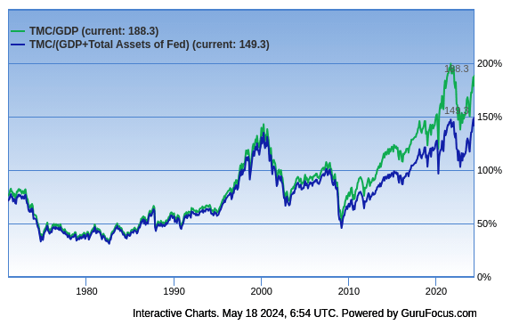
Since SCHX’s portfolio of U.S. stocks represent roughly 90% of the U.S. stock market, we think one way to evaluate the valuation of the broader market is to use the Buffett Indicator. This indicator basically uses the ratio of market capitalization to GDP to evaluate whether a country’s stock market is overvalued or undervalued. If the market capitalization to GDP ratio is in the range of 75% to 90%, the valuation is fair. If this ratio is above 90%, the country’s stock market is overvalued.
As can be seen from the chart below, the Buffett Indicator is currently 188.3%. This is significantly higher than the fair valuation range of 75%~90% and towards the high end of the historical valuation. Even if we consider the Federal Reserve’s assets, the ratio is still at 149.3%. This is still much higher than the fair valuation range.
GuruFocus.com
Can we simply conclude that the U.S. stock market is expensive? The answer is no. We think investors should also keep in mind that a lot of the large-cap companies in SCHX’s portfolio have sizable revenues and earnings derived from international markets. For example, Apple, Microsoft, Nvidia, Google, Amazon all derives a significant chunk of their income from international markets. Therefore, it is not accurate to use the GDP of the U.S. as the denominator. We think the U.S. stock market is not cheap, but not extremely expensive either.
Investor Takeaway
SCHB has slightly inferior performance than the S&P 500 index in the past. It is also likely going to underperform slightly to the S&P 500 index in the foreseeable future given its slightly lower exposure to the top U.S. stocks by market capitalization than the S&P 500 index. Therefore, we see little reason of owning SCHX unless the goal is to diversify the portfolio.
Additional Disclosure: This is not financial advice and that all financial investments carry risks. Investors are expected to seek financial advice from professionals before making any investment.
Enjoyed this article? Sign up for our newsletter to receive regular insights and stay connected.