
In 2013, when WisdomTree launched what is now known as the WisdomTree U.S. Quality Dividend Growth Fund (DGRW), the market looked very different. Many of the largest technology companies either paid no dividend at all or were not yet widely viewed as reliable sources of growing shareholder income. Today, that picture has changed dramatically. Some of the world’s most dominant mega-cap businesses now combine strong balance sheets, significant free cash flow and a growing willingness to return capital to shareholders.
That evolution matters because it changed what “dividend growth” can mean in practice. What once may have implied a narrower set of mature, defensive businesses can now include companies with very different sector exposures, profitability profiles and growth trajectories. The label stayed the same. The opportunity set did not.
As investors navigate the volatility of early 2026, it is a useful moment to step back and examine nearly 13 years of live results across some of the largest exchange-traded funds associated with the broad idea of dividend growth. The goal is not simply to compare performance tables. It is to ask a more important question:
When strategies share a similar headline, how different are the portfolios, and what have those differences meant over time?
I tend to simplify that evaluation into three core dimensions:
- Average annual return, ideally across a period of at least 10 years.
- Average annual volatility, to better understand the path investors took to earn those returns.
- Average annual Sharpe ratio, to measure excess return relative to the volatility required to generate it.
Figure 1a offers that starting point.
Figure 1a: Similar Labels, Different Long-Term Results
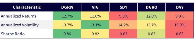
Sources: WisdomTree, FactSet, Morningstar specifically data from the Fund Comparison Tool in the PATH suite of tools, accessed April 25, 2026 with returns as of April 24, 2026, and both volatility and Sharpe ratio as of March 31, 2026. The period for these statistics starts as far back as possible for all strategies shown, June 10, 2014, the inception for DGRO. Green indicates a more favorable level for a characteristic, measured relative to the other ETFs, whereas red indicates a less favorable level for that characteristic. NAV denotes total return performance at net asset value. Past performance is not indicative of future results. Investment return and principal value of an investment will fluctuate so that an investor’s shares, when redeemed, may be worth more or less than their original cost. Current performance may be lower or higher than the performance data quoted. For the most recent month-end and standardized performance and to download the respective Fund prospectuses, click the relevant ticker: DGRW, VIG, SDY, Original Postroducts/264623/ishares-core-dividend-growth-etf" target="_blank" rel="noopener noreferrer">DGRO, DVY.
To add context to these results, it is important to recognize that these strategies are not built the same way, even if they are often discussed as part of the same “dividend growth” category.
DGRW seeks exposure to dividend-paying companies and weights them by cash dividends, while emphasizing measures such as return on equity, return on assets and earnings growth expectations.1 In other words, the strategy does not require a long record of past dividend increases. It is designed to identify companies with the financial characteristics that may support durable and growing dividends going forward.
Other well-known approaches take a different route. VIG focuses on U.S. companies that have increased dividends for at least 10 consecutive years, while excluding the highest-yielding portion of the eligible universe.2 SDY raises that requirement further, targeting companies in the S&P Composite 1500 Index that have increased dividends for at least 20 consecutive years. DVY leans more directly into dividend yield, while also incorporating aspects of dividend policy over the prior five years.3 DGRO emphasizes a history of uninterrupted dividend growth alongside the capacity to sustain that growth.4
Those distinctions may sound subtle at first. They are not. Most of these strategies explicitly anchor portfolio construction to a company’s historical dividend behavior. DGRW stands apart in that it does not. That difference has important implications for sector exposure, the types of businesses that enter the portfolio and, ultimately, the balance between quality, growth and valuation sensitivity.
Figure 1b shows standardized performance, but the more important takeaway is that investors should be careful not to assume that funds grouped under the same category are delivering the same underlying economic exposure.
Figure 1b: Standardized Performance
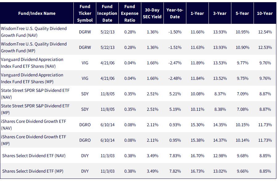
Sources: WisdomTree, FactSet specifically data from the Fund Comparison Tool in the PATH suite of tools, accessed April 25, 2026 with returns as of March 31, 2026. NAV denotes total return performance at net asset value. MP denotes market price performance. Past performance is not indicative of future results. Investment return and principal value of an investment will fluctuate so that an investor’s shares, when redeemed, may be worth more or less than their original cost. Current performance may be lower or higher than the performance data quoted. For the most recent month-end and standardized performance and to download the respective Fund prospectuses, click the relevant ticker: DGRW, VIG, SDY, DGRO, DVY.
One Category Label, Very Different Economic Exposures
At a high level, these strategies all appear to live in the same neighborhood. In reality, they own very different parts of the market.
Sector exposures reveal why. Some portfolios lean more heavily into Information Technology and Communication Services, giving them greater participation in the structural shift toward cash-generative mega-cap growth. Others tilt more meaningfully toward Utilities, Financials and Industrials, reflecting a more traditional income profile and a different set of macroeconomic sensitivities.
Those differences are not cosmetic. Sector composition influences how a portfolio responds to shifts in market leadership, interest rates, economic cyclicality and earnings durability. Two funds can both fall under the banner of dividend growth and still behave very differently when the market environment changes.
That is why dividend policy alone is not enough to explain outcomes. A strategy’s sector allocation helps determine whether it is gaining exposure to secular growers, defensive yield, economically sensitive cyclicals or some combination of the three. The common label may be “dividend growth.” The actual portfolio risk is much more specific.
Figure 2: Sector Exposure Is Where Dividend Growth Strategies Begin to Diverge
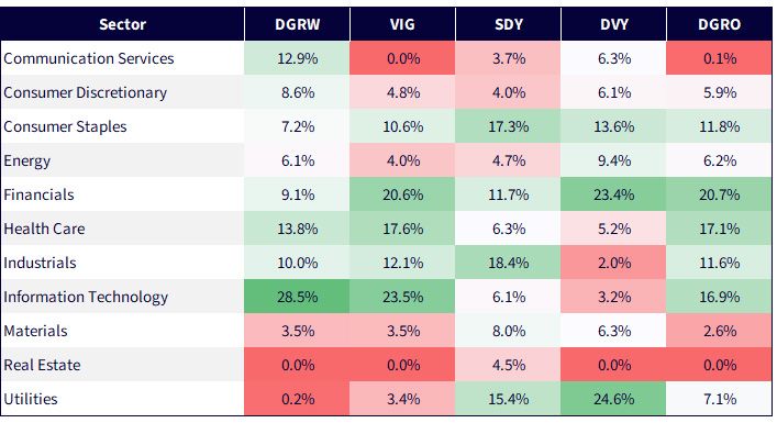
Sources: WisdomTree, FactSet, Morningstar, with data as of March 31, 2026. Green refers to a larger sector exposure for a given strategy, whereas red refers to a smaller sector exposure for a given strategy. Subject to change.
The Differences Become Obvious When You Look at the Names
A reader does not need to know every detail of index construction to understand that a portfolio topped by NVIDIA, Apple, Alphabet and Microsoft is offering something very different from one topped by Verizon, Realty Income, Chevron, Pfizer or Altria.
That is the value of looking at the top 10 holdings. It cuts through the category label and shows the portfolio as it really is. One approach may be capturing dividend growth through companies with dominant market positions, strong profitability and expanding cash flows. Another may be emphasizing firms more closely associated with legacy income, defensiveness or yield. Both can live inside the same broad conversation. They can still lead investors to very different outcomes.
In many ways, this is the point where the earlier sector discussion becomes real. Technology and Communication Services tilts are no longer just percentages in a table—they become Apple, Microsoft, Alphabet and Broadcom. Heavier exposure to Utilities, Energy, Consumer Staples or telecom is no longer an abstract portfolio characteristic —it becomes names like Verizon, Chevron, Altria and Pfizer. Figure 4 shows that once investors move from sectors to holdings, the differences among these strategies become much easier to see—and much harder to dismiss.
Figure 3: Sector Exposure Becomes Visible in the Names Investors Know
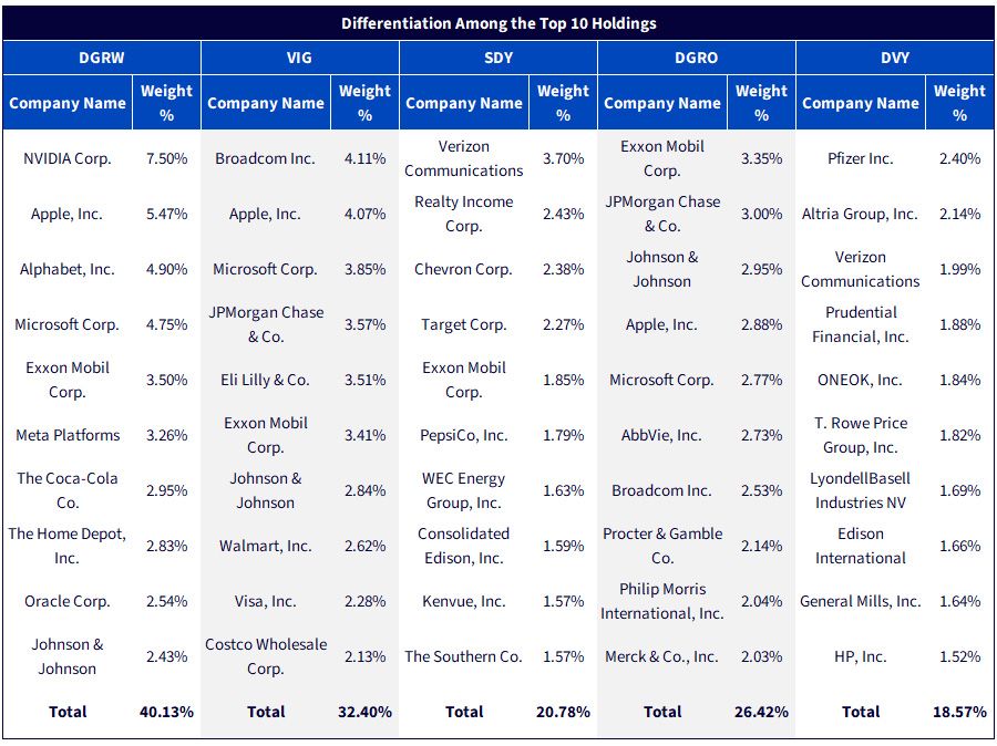
Sources: WisdomTree, FactSet, Morningstar, with data as of March 31, 2026. Subject to change.
Exposure Eventually Becomes a Quality Decision
Sector weights do more than shape economic sensitivity. They also influence a portfolio’s fundamental profile.
Strategies with larger allocations to Utilities, for example, often exhibit lower average return on equity and return on assets, reflecting the capital-intensive and regulated nature of those businesses. Earnings growth expectations also tend to be lower, consistent with more stable but slower-growing cash-flow streams. That can support a certain type of defensive income exposure, but it is not the same thing as owning companies with stronger profitability and faster expected growth.
By contrast, portfolios with heavier exposure to Information Technology and Communication Services often display stronger profitability metrics and higher expected earnings growth. In many cases, that reflects asset-light business models, higher margins and business lines with more structural revenue expansion.
Over time, those differences matter. Sector allocation is not just a top-down portfolio choice. It is one of the main channels through which a strategy ends up owning companies with different levels of quality, growth potential and resilience. What can look like a sector preference on the surface often becomes a very different fundamental profile underneath.
Figure 4: Sector Allocation Flows Through to Profitability Expectations
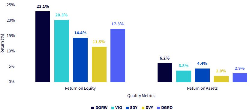
Sources: WisdomTree, FactSet, Morningstar, with data as of March 31, 2026. Green refers to a larger sector exposure for a given strategy, whereas red refers to a smaller sector exposure for a given strategy. Subject to change.
Conclusion: Position for the Cycle, Not the Headline
Dividend growth is not a monolith. Strategies that share a familiar label can differ meaningfully in sector exposure, profitability, earnings growth expectations and, ultimately, long-term investor experience.
In quieter markets, those distinctions can be easy to overlook. During more volatile periods, they become much harder to ignore. What often appears to be a debate about valuation risk is, in many cases, really a debate about durability: which businesses are best positioned to sustain cash flows, adapt to changing leadership and continue compounding through full market cycles.
A disciplined focus on quality and growth does not eliminate drawdowns, nor should investors expect any single framework to outperform in every environment. But portfolio construction still matters. For investors looking beyond the headline term “dividend growth,” the more important question is not simply whether dividends have risen in the past. It is what kind of businesses a strategy is selecting today, and what that implies for the cycle ahead.
Enjoyed this article? Sign up for our newsletter to receive regular insights and stay connected.